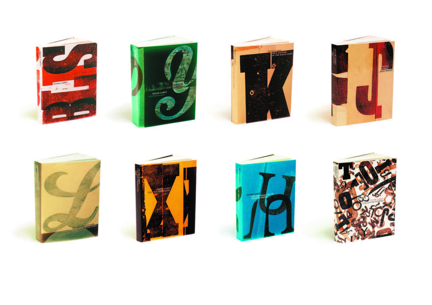
 Jenny Grigg, Peter Carey Collection, 2001
Series Design, University of Queensland Press
If a book shouldn’t be judged by its cover, then Jenny Grigg might have to surrender the impressive swag of awards she has received in recent years for book design. In large part, Grigg has Peter Carey to thank for the seven Australian Publishing Awards received since 2002. Or is it the other way around because surely Carey’s literary fiction has garnered attention in design circles where talk of his work might not usually take place?
Striking for their innovate use of handmade aesthetics, letterpress type and deckle-edge pages, Grigg’s designs for the Carey oeuvre have become contemporary design classics responsible for ushering in new approaches and processes to the art of book design – an often overlooked part of the relatively small publishing industry in Australia. Grigg plays with the conventional shape and feel of the book, treating it more as a sculptural entity to be engaged with on various sensory levels. In fact, Grigg’s designs are so seductive because she understands how books are never simply visual in their appeal. The exquisite tactility of books – their need to be stroked, caressed and fetishised – is a chief reason why Grigg’s work has made such an impact, and will be emulated for years to come.
Hailing from the world of magazine design, where she cut her teeth as an art director on plum corporate gigs like Rolling Stone and HQ in the 90s, Grigg has established herself at 38 years of age as a leading designer of her generation. Based in Brisbane, Grigg is setting new and truly international standards for Australian design practice. Only days before she was to fly to Copenhagen, where she will complete some freelance work acquired in Australia, Grigg took time out of her hectic schedule to answer a few of my questions.
How did you get into design?
I got into design by drawing as a child and teenager, enjoying making realistic illustrations and paintings of animals and plants. And then realising I could take this further at uni I initially enrolled in a visual arts degree, but changed at the last moment to the Visual Communication degree at what is now University of Technology Sydney. At the last moment I realised I could be an artist in the commercial world and this appealed more, to be a part of the more general world.
How did your early art direction experience shape your design identity?
I left college as an illustrator and took commissions for magazines. And then a friend told me a design position was available on a teenage music magazine, which eventually took me to two much more involved experiences as an art director at Rolling Stone and HQ. I really was in the deep end at the beginning, I mean I was the art director of an international standard magazine, and I don’t think I’d ever commissioned a photo shoot before. Rolling Stone in Australia are a remote annex to the US design office. The creative direction came from Fred Woodward in the US, and I looked at my role as absorbing this style, and adapting our Australian articles to it. I enjoyed following the lead from there – the perimeters were set but allowed plenty of room to play. Every two weeks the US issues arrived, and the design was so alive. It was always great to see how they had reinvented their type and imagery; which illustrators and photographers they had. And it was amazing to see how much care was taken with detail. All of the type was immaculately hand- kerned, even the body copy, not a widow in sight. The control they had of their craft was extensive and as a team they used it all. So I guess what I learned early on, was that there is no such thing as too much trouble to get a particular result. I never met Fred Woodward and his team, but I thank them.
How did you come to be involved designing Peter Carey’s books?
A few years after Rolling Stone I was in Brisbane and visited University of Queensland Press who were about to release Peter Carey’s backlist and were looking for a designer. Similar to Rolling Stone, the set-up there was small internally, which allowed for core design ideas to be carried through. There was no unnecessary interference to the design from non-design areas, and what I put forward as designs were accepted and trusted. Peter Carey had such a great response to the first series of letterpress designs, which gave me total confidence to carry through on what I began.
To what degree was Peter Carey involved in the designing of his books?
I have learnt a lot from Peter in the process of designing for his novels. I have the sense of what he wants from brief unstructured email comments saying that he preferred the looser early version, or that he wants a particular release to be very bold this time – or how he might really like a design but that it is too quiet. He can sense when I over-think or over-work things and lose the spirit of something. He is direct but never damning or critical. And he responds on an emotional level, wanting the images to give the right feel. With Peter, the link between the written and the visual language is enjoyable and useful. It doesn’t always run smoothly. As with most productions there are frustrations, but there is a common appreciation and respect for what might result. When you don’t have this foundation, it can be really difficult to know what you are doing. And sadly this is rare in my experience of book design. The potential for what can be created is enormous, but usually the people involved in the process are each sitting in separate rooms, on unsteady chairs, facing out different windows. Smaller publishing houses will be able to get out of this bad habit more quickly than large houses if they want to.
Is the publishing industry responding more to the role of design?
Designing for Peter, who has such a sophisticated mind and visual sense, has been a great challenge, and great for Australian publishing design I think. With his latest release Theft: A Love Story, the production values are very good. Because they are spoken about and craved at both the design and the author level, this can influence publishing decisions in regards to budget. When Theft was launched, the quality of the final production was spoken about, truly appreciated, considered a subject. It gives the production craft of book design the opportunity of reflecting the craft of such a writer. And this is happening more in Australia, allowing some books to be crafted to an international level.
Why is typography so important to your design practice?
Typography is great fun. To me the characters are characters. They come in all forms, shapes sizes, personalities, they let you do all kinds of things to them, and they also serve a purpose. There are endless ways manipulate them to create a mood, bend to a design brief. They are elements of illustration in themselves. They speak a different language depending on what you ask them to do.
Is including a sense of Australian identity important to your design work?
I tend to respond to the material supplied in the first instance, so this would have to be part of the subject I was dealing with. When it is relevant, it is rewarding to contribute this way.
What are your thoughts on Brisbane as an up and coming design centre?
I haven’t spent too much time in Brisbane, but it seems to be poised really well, as it is at the beginning of discovering it can do all these things. You can no longer say, well, nobody in Brisbane is into this kind of stuff, because enough are. And sometimes it is easier to create when you see empty spaces and you want to fill them, as opposed to Melbourne where I sometimes feel it is overladen where there is little the room to move.
What exciting design projects have you got coming up?
Creating books from scratch to concentrate on the simple art of telling stories with words and images, and then thinking about the marketing of them.
Profile/interview for Empty.
Published by Empty, issue 7 in 2006.